LinkedIn Usability Issue
2011-07-14LinkedIn has been employing questionable tactics to expand their membership and stickiness. It’s taken me several visits to their website on different occasions to (mostly) get removed from their many different email lists.
But the issue I ran into today is inexcusable.
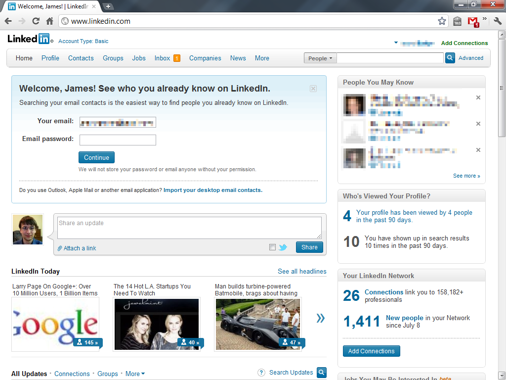
This is what I saw when I hit the front page of LinkedIn. Note that there’s a big email/password box right in the middle of the page. It has my email in it. Clearly, my session has expired and I need to re-enter my password, right?

Look again.
I was already logged in. That big box smack-dab in the middle of the screen was asking for my email password so that it could import all my contact’s email addresses out of my webmail account. What is wrong with this picture?
People don’t read anything. I’m definitely not the first person to assume that this was a LinkedIn login box.

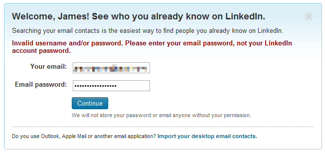
I saw that red text three times before I realized why I wasn’t being taken to my LinkedIn profile. The text indicates that LinkedIn knows this is an issue. Given that people don’t read anything, any many people use their email password for other services, it’s irresponsible to design a website like that. When your service allows users to accidentally import information, you have a major issue.
This is on top of how having a 3rd party site asking for a user’s email password is an awful idea.
 JamesGecko