Dark Souls 3DS
2014-09-03Nintendo announced a new version of the 3DS with more buttons about a week after I wrote the bulk of this. Ah, well. It’s still an interesting exercise. What would Dark Souls look like if it was on the first generation Nintendo 3DS?
Attack and defense controls
The 3DS has fewer controller buttons than the other consoles that Dark Souls games are released on. We’ll have to rejigger things a bit, starting with attack controls. On the Xbox, the trigger configuration looks like this:
L1- ShieldL2- Shield bashR1- Quick attackR2- Slow, heavy attack
The 3DS only has two trigger buttons. Maybe it could work like this:
L1- ShieldL1 (hold) + R1- Shield bashR1 (tap)- Quick attackR1 (hold)- Heavy attack
R1 is changed by necessity. The longer the button is held down, the farther back the avatar pulls it’s weapon and the stronger the attack.
Camera
The 3DS doesn’t have two sticks. There’s the circle pad pro accessory, but most people don’t own one and the 2DS can’t use it. Camera would thus have to be good enough that the player wouldn’t need to use it much during combat.
Monster Hunter displays a virtual Dpad for camera control on the touch screen, but that has terrible ergonomics (even worse on the 2DS, where the touch screen is farther away from the physical buttons) and it feels like a hack.
About the best we can do here is to say that left Dpad and right Dpad would rotate camera, Up Dpad would lock on, and down Dpad would rotate the camera 180 degrees.
Inventory
There’s a lot of text and scrolling in Dark Souls, which doesn’t really work well on a small screen. Honestly, it doesn’t work well on consoles, either; you couldn’t really glance at your inventory and get a sense of what was in it, and it was difficult to quickly locate things to compare them.
Let’s see if we can make the inventory more usable. Something quick, like in Link’s Awakening would be ideal.
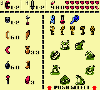 I really liked how you could pull up the inventory and press (A) or (B) to equip something to those buttons. Let’s say that you do that with the
 L1 and R1 triggers when the menu is open.
The problem is that this setup doesn’t convey much information. Displaying info about the currently selected item only goes so far. Particularly weight is fairly important. What’s a good way to convey this information at a glance? We could make heavy items take up several squares, like in Diablo 2.
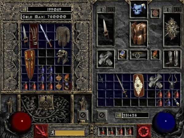
The problem there is that inventory management becomes a bit of a game in itself (inventory tetris!), and we want to reduce that. Rearranging items also doesn’t work well with a Dpad, and it would be nice if the entire game was playable without touching the stylus; particularly because bringing up the menu doesn’t pause the game; the player can get attacked while looking at their inventory.
I’m thinking something like this:
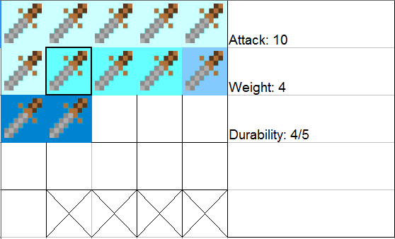
Here’s an inventory full of swords, because I’m lazy. If an item is heavy, it’s background is colored more darkly. If it’s particularly heavy, some of the grid slots at the bottom are unavailable. In this example, each sword with the darkest background is also blocking off two slots at the bottom. This is more or less equivalent to the inventory tetris approach, but fitting awkward shapes together is less of an issue. How does the player know how many squares at the bottom an item is taking up? Maybe those squares are highlighted when the item is selected. Hopefully the relationship is reasonably clear.
Invasions
Invasions add a lot to the tense feeling of the game, but we can’t count on the player having a network connection. The player can already summon NPC aid at certain places. Why not have NPC invasions as well? In each major area of the game, there is a rift. Occasionally, unpredictably, and not too often, the rift will spawn an invader. There can only be one invader at a time, and if the player finds and seals the rift, they won’t be hunted in that area anymore. Unless an invader follows them in from another area…
Graphics
The 3DS screen is small and low resolution. I kind of want to say that the contrast should be improved a bit.
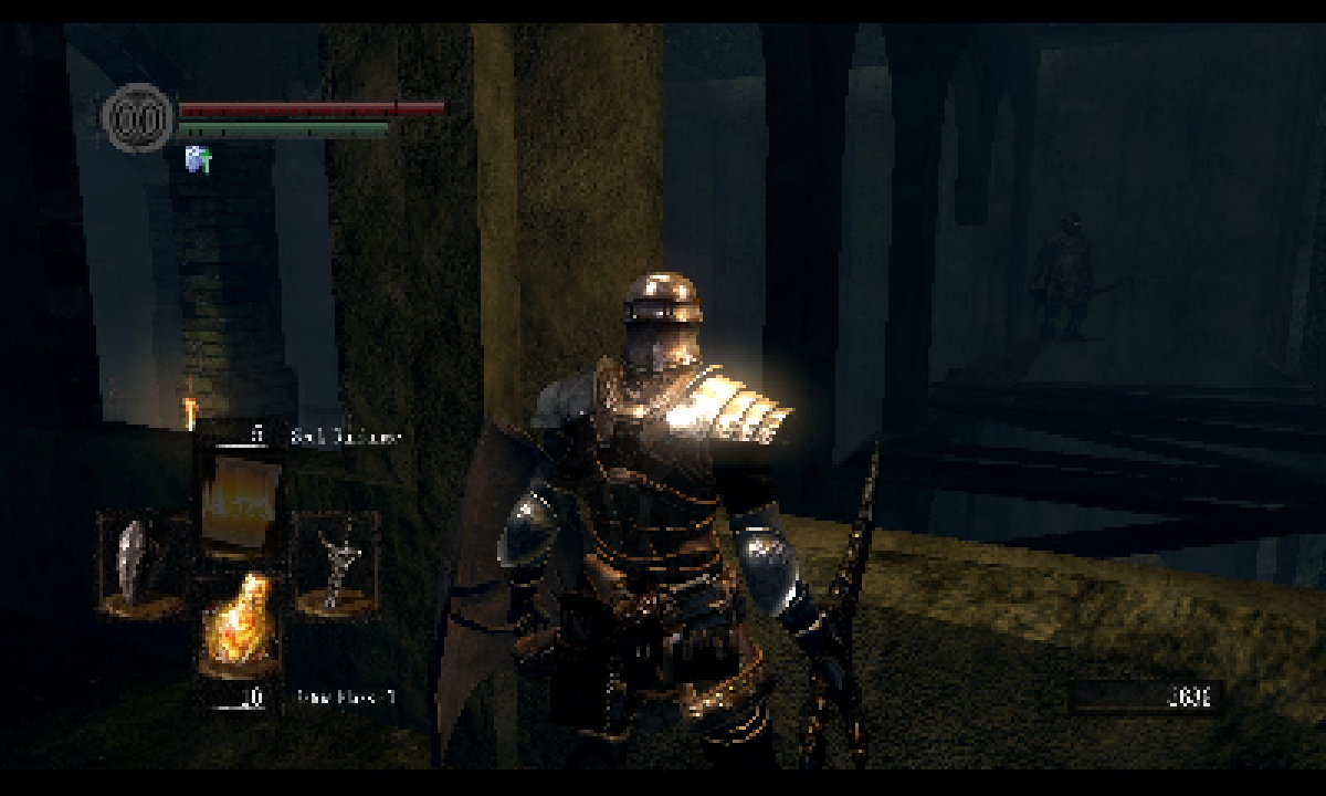
(Do you see what I see?)
Easy-to-miss things are part of the game, but once you’re in combat, you should be able to read the enemy easily.
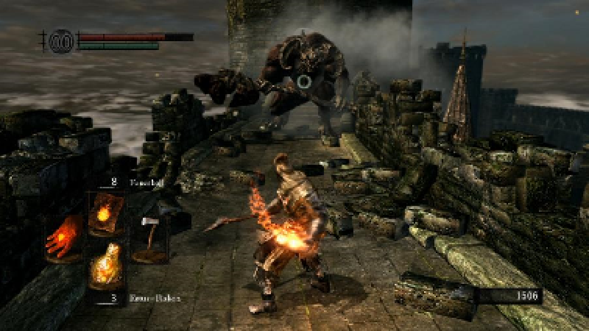
(Even this boss is a little hard to see clearly when the screenshot is scaled down)
This is a larger problem on the 2DS and normal 3DS, which have smaller screens. The Arkham Batman games had a similar problem: drab dark enemy colors in lots of dark environments. They solved it by adding a toggled vision mode in which dangerous enemies turned bright colors.
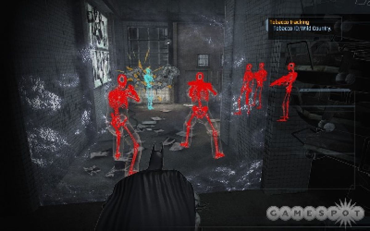
It was so much easier to read enemy moves that I would often turn it on before engaging enemies. An heat/x-ray vision mode wouldn’t fit in Dark Souls as it stands, but perhaps enemies could gain a highlight or become lighter when they engage you.
The 3DS/3DSXL could also use 3D to highlight hidden areas or enemies. It couldn’t be the only indicator though; the game must be playable if 3D is turned off.
So, that’s that. Hopefully we’ll see a portable version when the third game in the series arrives. With an potential title acronym like 3DS DS3, how could any software development house resist?
 JamesGecko